|
Home |
Download |
Statistics |
Landscape |
Help |
Contact |
Instructions for Navigating the Site
1. ImmunEscpMap information2. Webpage navigation
a. Search by Gene symbol or Entrez gene ID
b. Browse by cancer type or immune escape mechanism
3. Understanding gene annotation of ImmunEscpMap
a. Gene summary
b. Literature curation
c. Tumor vs Normal
i. Gene expression
ii. Methylation
iii. Copy number variation
d. Mutated vs Wildtype: DEGs and enrichment analysis
e. Non-responders vs Responders after immunotherapy
f. Tumor infiltrating lymphocytes
g. Gene expression and immune subtypes/status
h. Gene-related drugs and diseases
i. Survival analysis
4. Download data and contact us
The ImmunEscpMap database provides functional analyses of 517 genes related to 8 cancer immune escape mechanisms. The figures illustrates the key idea of each mechanism.
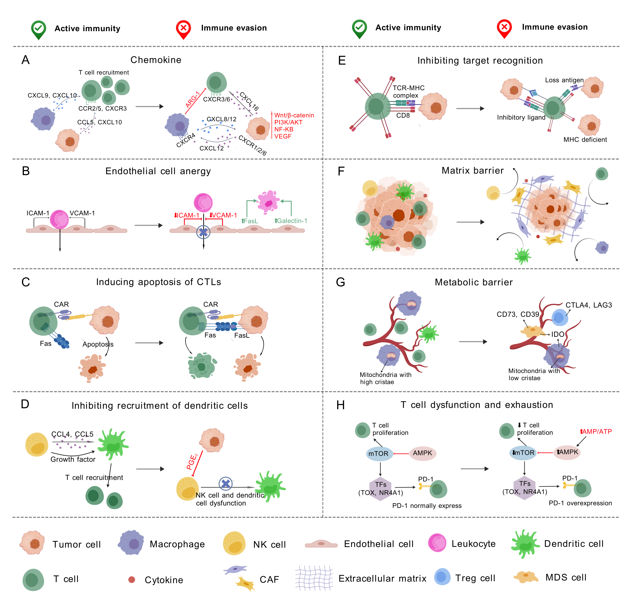 (A) Chemokine: The chemokine ((C-X-C motif) participates in the generation and recruitment of immune cells that contribute to a pro-tumorigenic microenvironment; (B) Endothelial Cell Anergy: During angiogensis, the lack of endothelial adhesion molecules suppress the immune infiltration. In addition, the endothelial cells express immunosuppressive molecules that induce the apoptosis of immune cells; (C) Inducing Apoptosis of Cytotoxic T Cells (CTLs): The cancer cell upregulates FasL, which can bind to Fas expressed by activated T cells, leading to T cell apoptosis; (D) Inhibiting Recruitment of Dendritic Cells: Tumor cell derived PGE2 can inhibit the function of natural killer cells and the recruitment of dendritic cells; (E) Inhibiting Target Recognition: The T cell responses can be inhibited by the involvement of inhibitory ligand, the lack of MHC class I molecules and the loss of neoantigens; (F) Matrix Barrier: The extracellular matrix and surrounding cancer associated fibroblasts can create a physical barrier that suppresses immune cell infiltration; (G) Metabolic Barrier: The dysregulated vasculature reduces oxygen and nutrient levels in the tumor core and prevents metabolites that suppress T cells from being transported out of the tumor; (H) T Cell Dysfunction and Exhaustion: AMPK overexpression inhibits mTOR activity, which modulates downstream transcription factors such as TOX and NR4A1, leading to altered PD-1 expression and contributing to T cell exhaustion and dysfunction.
 2. Webpage navigation
a. Search by Gene symbol or Entrez gene ID.
- Input query: Gene symbol or Entrez gene ID. For example, by searching "Gene symbol: IFNG" or "Entrez gene ID: 3458", the webpage will jump to the gene information for your query.

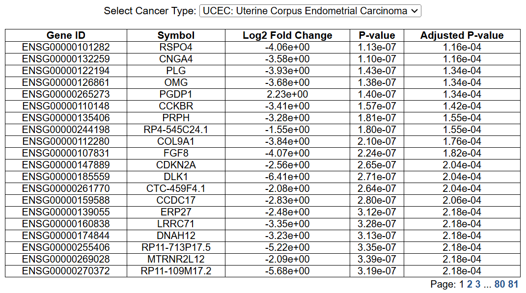
 b. Browse by cancer type or immune escape mechanism
By clicking on one of the cancer types or immune escape mechanisms, the users can check the list of genes with evidences in literatures.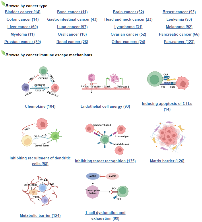
3. Understanding gene annotation of ImmunEscpMap
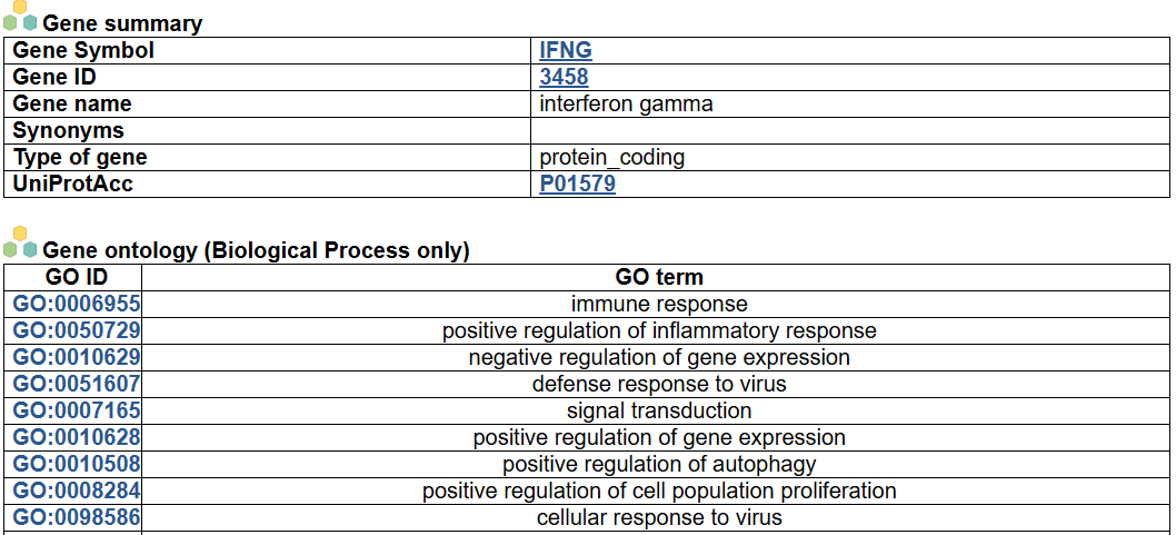
a. Gene summary
- This image shows the summary information of the queried gene, including the gene symbol, ID, name, synonyms, type, UniProtAcc link and the ontology information (Biological Process only).
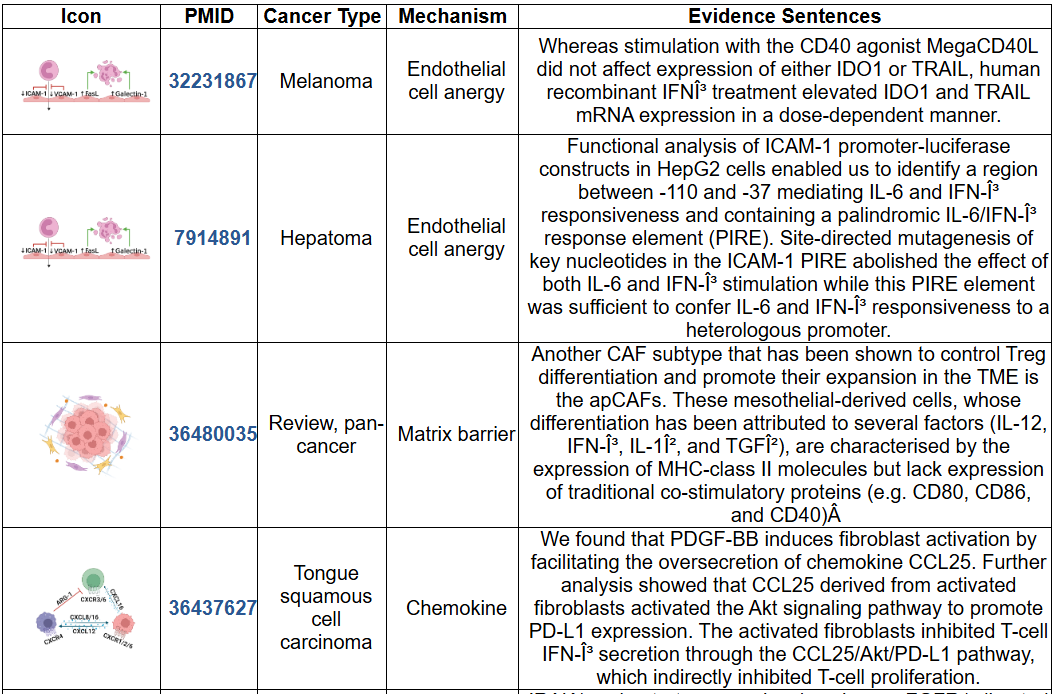
b. Literature curation
- This image shows the literature records supporting the association of this gene and the cancer immune escape, including the mechanism icon, PMID, cancer type, immune escape mechanism and the evidence sentence. The literature mining was done by extracting abstracts from PubMed database using Esearch and Efetch, and manually filtered genes related to tumor immune evasion. The input keywords were "cancer" and concepts related to 8 mechanisms such as "endothelial cell anergy", "endothelial cell dysfunction", "endothelial immune escape", "matrix barrier", "extracellular matrix", "cancer-associated fibroblasts", "chemokine immune escape", "chemokine immune evasion", "inhibiting MHCI expression", "inhibiting MHCII expression", "inhibiting neoantigen expression", "neoantigen burden", "dendritic cell recruitment", "T cell dysfunction", "T cell exhaustion", "metabolic barrier", "metabolic immune evasion", and "induce CTLs apoptosis".
c. Tumor vs Normal
For each cancer type in TCGA, if both the number of tumor and normal samples are no less than 5, we compare the gene expression and methylation level between groups, as well as the correlation between expression and methylation. In addition, we summarize the copy number alteration in tumor samples across cancer types, and the correlation between expression and copy number.
 i. Gene expression
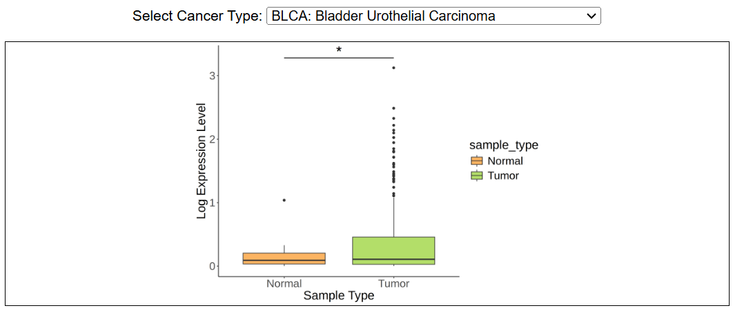
This image shows the difference in gene expression level across cancer types in TCGA. The threshold for adjusted p-value is shown as : ***, padj < 0.001; **: 0.001 < padj < 0.01; 0.01 < padj < 0.05; NS: padj > 0.05.
 ii. Methylation
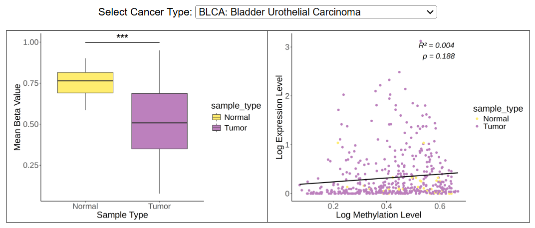
The boxplot shows the mean beta value in normal and tumor group, and the dotplot shows the correlation between methylation level and expression level. Methylation in promoter and genebody region are analyzed separately.
 iii. Copy number variation
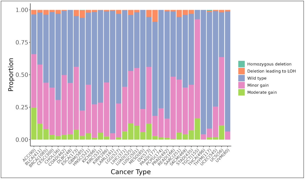
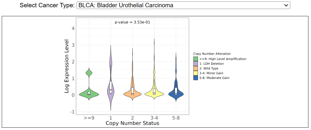
This image shows the copy number variation across cancer types in TCGA. The violin plot shows the correlation between copy number and expression level. The gene level copy number is annotated as: 0: homozygous deletion; 1: deletion leading to LOH; 2: wild type, including copy-neutral LOH; 3/4: minor gain; 5-8: moderate gain; >=9: high-level amplification.
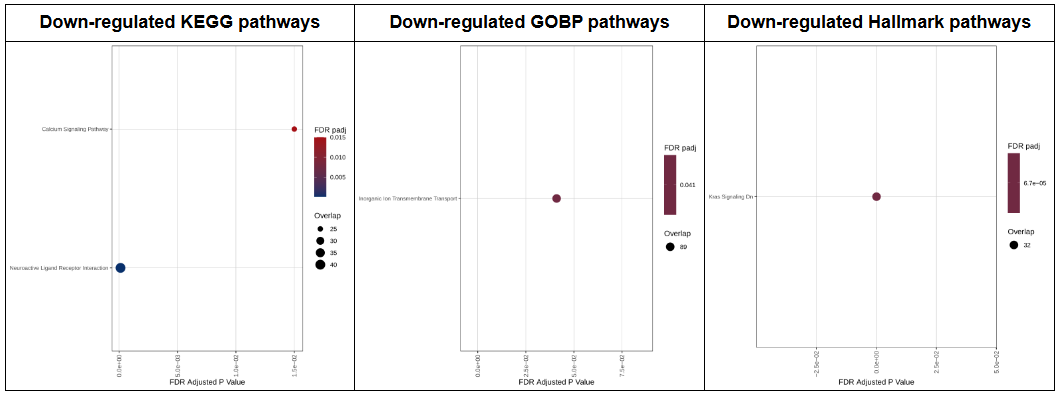
 d. Mutated vs Wildtype: DEGs and enrichment analysis
For each cancer type in TCGA, if there are more than 5 samples with non-synonymous mutations, we calaulated the differentially expressed genes and KEGG, GOBP, Hallmark enriched pathways between mutated and wildtype groups.
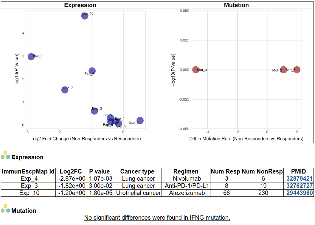
 e. Non-responders vs Responders after immunotherapy
We collect 16 datasets (10 for expression and 6 for mutation) consisting of at least 2 responders and non-responders and compare the gene expression and mutation difference between groups. The image shows the difference in gene expression level and mutation rate between non-responders and responders after immunotherapy. The significant results (padj < 0.05), including the detailed information of datasets are presented in the table.
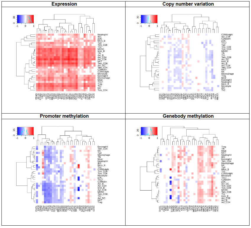
 f. Tumor infiltrating lymphocytes
This heatmap shows the correlation between the gene expression, copy number, methylation, and immune cell abundance.
 g. Gene expression and immune subtypes/status
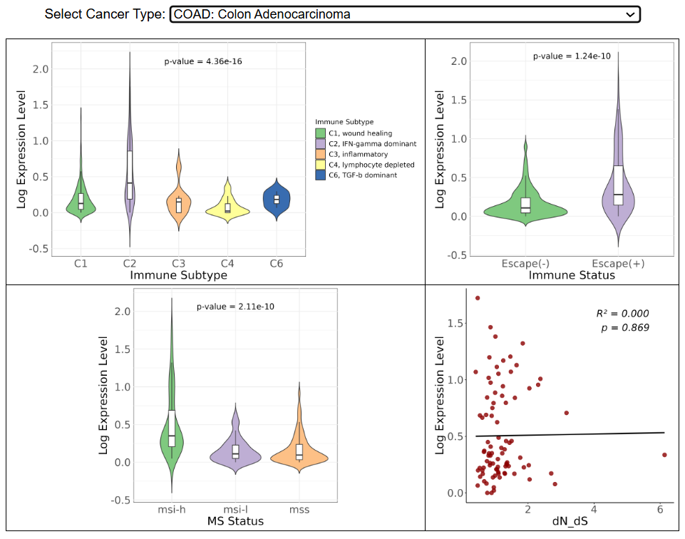
The violin plots compare the gene expression level in six immune subtypes, escaped(-/+) and different microsatellite instability status respectively. The dotplot shows the correlation between expression level and dN/dS, the ratio of nonsynonymous to synonymous mutations in the immunopeptidome.
 h. Gene-related drugs and diseases
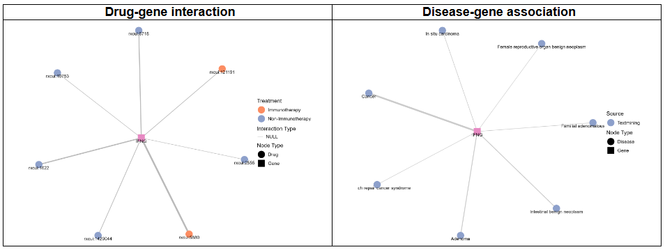
The left network graph shows drugs targetting the gene, derived from the Drug-Gene Interaction Database (DGIdb, https://dgidb.org) 5.0. The right network graph shows the disease-gene associations from curated databases, genome-wide association studies (GWAS) and literature mining, which is obtained from Diseases 2.0 (https://diseases.jensenlab.org/Search).
 i. Survival analysis
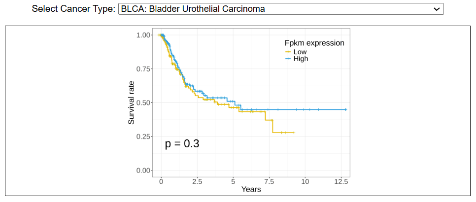
This image shows the survival analysis using TCGA data. Kaplan-Meir curves reflects the association of gene expression with overall survival across different cancers. The significance (p value) is assessed by log-rank test.
 4. Download data and contact us
Please go to download page and contact page.
(A) Chemokine: The chemokine ((C-X-C motif) participates in the generation and recruitment of immune cells that contribute to a pro-tumorigenic microenvironment; (B) Endothelial Cell Anergy: During angiogensis, the lack of endothelial adhesion molecules suppress the immune infiltration. In addition, the endothelial cells express immunosuppressive molecules that induce the apoptosis of immune cells; (C) Inducing Apoptosis of Cytotoxic T Cells (CTLs): The cancer cell upregulates FasL, which can bind to Fas expressed by activated T cells, leading to T cell apoptosis; (D) Inhibiting Recruitment of Dendritic Cells: Tumor cell derived PGE2 can inhibit the function of natural killer cells and the recruitment of dendritic cells; (E) Inhibiting Target Recognition: The T cell responses can be inhibited by the involvement of inhibitory ligand, the lack of MHC class I molecules and the loss of neoantigens; (F) Matrix Barrier: The extracellular matrix and surrounding cancer associated fibroblasts can create a physical barrier that suppresses immune cell infiltration; (G) Metabolic Barrier: The dysregulated vasculature reduces oxygen and nutrient levels in the tumor core and prevents metabolites that suppress T cells from being transported out of the tumor; (H) T Cell Dysfunction and Exhaustion: AMPK overexpression inhibits mTOR activity, which modulates downstream transcription factors such as TOX and NR4A1, leading to altered PD-1 expression and contributing to T cell exhaustion and dysfunction.- Input query: Gene symbol or Entrez gene ID. For example, by searching "Gene symbol: IFNG" or "Entrez gene ID: 3458", the webpage will jump to the gene information for your query.
By clicking on one of the cancer types or immune escape mechanisms, the users can check the list of genes with evidences in literatures.
- This image shows the summary information of the queried gene, including the gene symbol, ID, name, synonyms, type, UniProtAcc link and the ontology information (Biological Process only).
- This image shows the literature records supporting the association of this gene and the cancer immune escape, including the mechanism icon, PMID, cancer type, immune escape mechanism and the evidence sentence. The literature mining was done by extracting abstracts from PubMed database using Esearch and Efetch, and manually filtered genes related to tumor immune evasion. The input keywords were "cancer" and concepts related to 8 mechanisms such as "endothelial cell anergy", "endothelial cell dysfunction", "endothelial immune escape", "matrix barrier", "extracellular matrix", "cancer-associated fibroblasts", "chemokine immune escape", "chemokine immune evasion", "inhibiting MHCI expression", "inhibiting MHCII expression", "inhibiting neoantigen expression", "neoantigen burden", "dendritic cell recruitment", "T cell dysfunction", "T cell exhaustion", "metabolic barrier", "metabolic immune evasion", and "induce CTLs apoptosis".
For each cancer type in TCGA, if both the number of tumor and normal samples are no less than 5, we compare the gene expression and methylation level between groups, as well as the correlation between expression and methylation. In addition, we summarize the copy number alteration in tumor samples across cancer types, and the correlation between expression and copy number.
i. Gene expressionThis image shows the difference in gene expression level across cancer types in TCGA. The threshold for adjusted p-value is shown as : ***, padj < 0.001; **: 0.001 < padj < 0.01; 0.01 < padj < 0.05; NS: padj > 0.05.
ii. MethylationThe boxplot shows the mean beta value in normal and tumor group, and the dotplot shows the correlation between methylation level and expression level. Methylation in promoter and genebody region are analyzed separately.
iii. Copy number variationThis image shows the copy number variation across cancer types in TCGA. The violin plot shows the correlation between copy number and expression level. The gene level copy number is annotated as: 0: homozygous deletion; 1: deletion leading to LOH; 2: wild type, including copy-neutral LOH; 3/4: minor gain; 5-8: moderate gain; >=9: high-level amplification.
For each cancer type in TCGA, if there are more than 5 samples with non-synonymous mutations, we calaulated the differentially expressed genes and KEGG, GOBP, Hallmark enriched pathways between mutated and wildtype groups.
We collect 16 datasets (10 for expression and 6 for mutation) consisting of at least 2 responders and non-responders and compare the gene expression and mutation difference between groups. The image shows the difference in gene expression level and mutation rate between non-responders and responders after immunotherapy. The significant results (padj < 0.05), including the detailed information of datasets are presented in the table.
This heatmap shows the correlation between the gene expression, copy number, methylation, and immune cell abundance.
The violin plots compare the gene expression level in six immune subtypes, escaped(-/+) and different microsatellite instability status respectively. The dotplot shows the correlation between expression level and dN/dS, the ratio of nonsynonymous to synonymous mutations in the immunopeptidome.
The left network graph shows drugs targetting the gene, derived from the Drug-Gene Interaction Database (DGIdb, https://dgidb.org) 5.0. The right network graph shows the disease-gene associations from curated databases, genome-wide association studies (GWAS) and literature mining, which is obtained from Diseases 2.0 (https://diseases.jensenlab.org/Search).
This image shows the survival analysis using TCGA data. Kaplan-Meir curves reflects the association of gene expression with overall survival across different cancers. The significance (p value) is assessed by log-rank test.
Please go to download page and contact page.

Copyright 2024-Present -The University of Texas Health Science Center at Houston